Summer Internship · Lead Submit & Landing Page Team
Web Development · Graphic Design
HTML/CSS/JS/JQ · Adobe Illustrator · Adobe XD · InstaPage · Maxymiser
A/B Testing · Iteration · Usability Testing
My internship at Quicken Loans requires a lot of coding and tweaking of their original designs. With the help of Maxymizer and Instapage, I was able to learn more about Javascript, and design as a whole. Below are a collection of designs and tweaks I made to their landing pages, as well as potential designs and they can utilize in the future
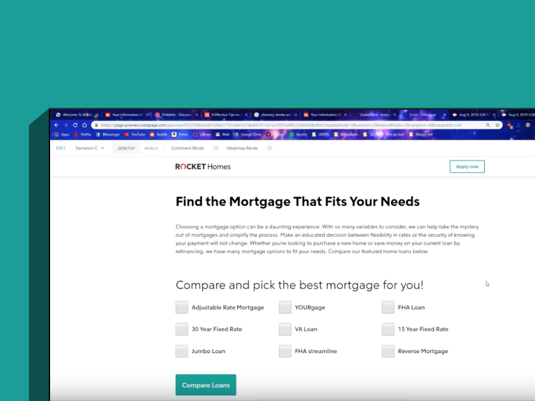
This page provides the user with a series of options when looking to get a mortgage. I made the bounce animation as a pleasant way for the user to know what they're hovering over. The description underneath would also change based on what is being hovered over. This portal gives the user enough information to proceed with the process, but not enough where it would overwhelm them.
This is the landing page for Rocket HQ, a company designed to help you monitor your credit and help you get mortgage-ready. This is where I primarily learned about CTAs and the different techniques used to increase click rate and conversion.
The mortgage comparison chart was an outdated, old pdf pasted onto the webpage, yet it had more traffic than most of the pages on the Quicken Loans website. Because of this, I created an interactive mortgage comparison chart that shows off the benefits of each mortgage plan alongside one another.
This version of the QL/RM landing page focuses on accessibility and better feedback. The progress bar shows the user which section of the assessment they're on, which allows them better feedback regarding their progress. The layout also allows the user easy access back to an unanswered question, and smoothly autoscrolls to the next one once clicked for a better experience.
This chart was an add on to an article discussing needs and wants and what to look for when searching for a home.
This was a fun little experiment we did to see if dark/light mode made a difference in a person's viewing experience.
When distracted, users respond to motion. This popup is a non-intrusive way to convince users to complete their assessment and submit a lead.
I added little informational buttons next to the form options to help clarify to the user what each section is asking for.
For the lead submission form, the team wants every question to be answered, ideally. Because of this, the greyed out, turned off button will force the user to answer correctly before proceeding to the next question.