Freelance consulting
Graphic Design
Adobe Illustrator · Adobe Photoshop
Consulting · Iteration
The Michigan Kendo Club approached me and asked me to make a logo and a sigil for them to put on their shirts and jackets. During the time helping them out, I developed multiple iterations of several types of logos, and eventually narrowed down to a few selected to perfect. I did a lot back and forth between their sensei to capture the right feel and symbols of the sport.
Armed with nothing more than a quick googling of kendo and what they do, how they look, I developed these initial designs:
After testing out my first iterations, I got feedback from the sensei with really helpful points regarding the nature of kendo and what I should be capturing within the logo:
"I agree that these are a great start! But I would challenge you with trying to capture the essence of what we do versus focus on a particular component. The reason being, that using the single shinai (sword) could be confused with other martial arts such as Takendo (dagger fighting) or one of the other sword school's styles. The second design catches the concept of 2 pretty nicely, but crossed in an "x" pattern loses a chance to relate concepts of space/timing/distance/speed. See if you can create a graphic that catches or inspires a feeling of those components."
After this feedback, I went back to researching more about kendo -- looking at the way they hold the shinai, looking at their armor, and most importantly looking for those moments of "space and timing".
Kendo is all about patience and distance; waiting at the perfect time, calculating the perfect opportunity, and striking at the perfect moment. It requires discipline, speed, and timing. The following iterations was what I decided on through these revelations.
These iterations were a lot closer to what the club wanted. The touch of the shinai against one another is a ritual that happens before every match, and imperative to readying yourself. However, some things were still off; the angle of the shinai in the first was too high, the men (headgear) in the middle, while balanced, did not make sense in the space it's in, and the "KMC" looked awkward and could be possibly read wrong.
With these changes in mind, I created the following:
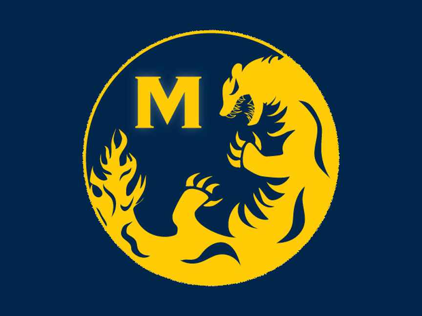
At this point, I was getting close to the right logo. The men facing one another is more accurate to the style of the fight, with the angle of the shinai more angled downward. With a few more tweaks, I landed on the final iteration, with a sigil I made for their jackets.


I modeled the sigil after the Japanese style of art, using the wolverine as the animal of choice. The "K" in the second design utilizes 2 shinai and broad strokes found often in Japanese calligraphy. The circle in the background is a subtle reference to the sun on the flag of Japan. As for the last design, the 2 shinai and the 2 men are an essential part of kendo, with the phrase "essence of mind" underneath to encapsulate the essence of kendo.