
Independent Research · Collaboration with PhD candidate Yixin Zou & Professor Florian Schaub
UX Research · UX Design
Adobe Illustrator · Rev Transcription · Overleaf
Control/treatment group interviews · Recording and Transcription
Data breach notifications are letters that companies are required to sent to affected individuals after a data breach. However, these notifications are often ineffective in motivating affected individuals to take appropriate reactive and protective actions. We present an enhanced data breach letter design that aims to improve comprehension and actionability of included information. We conducted a small-scale, between-subjects experiment comparing our design to a current breach letter. Our preliminary findings indicate that our design increases comprehensions and actionability and further provides insights for further design improvements to make data breach notifications useful and usable consumer protection tools.
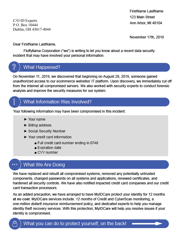
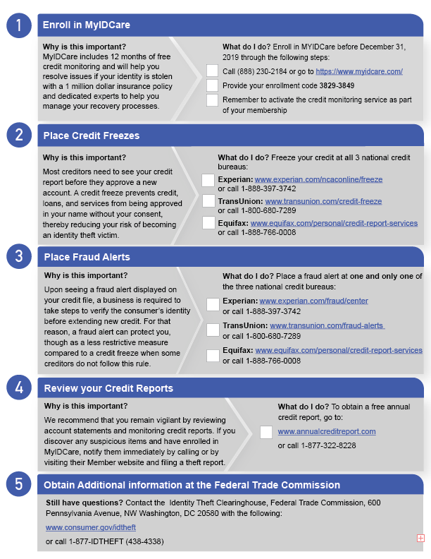
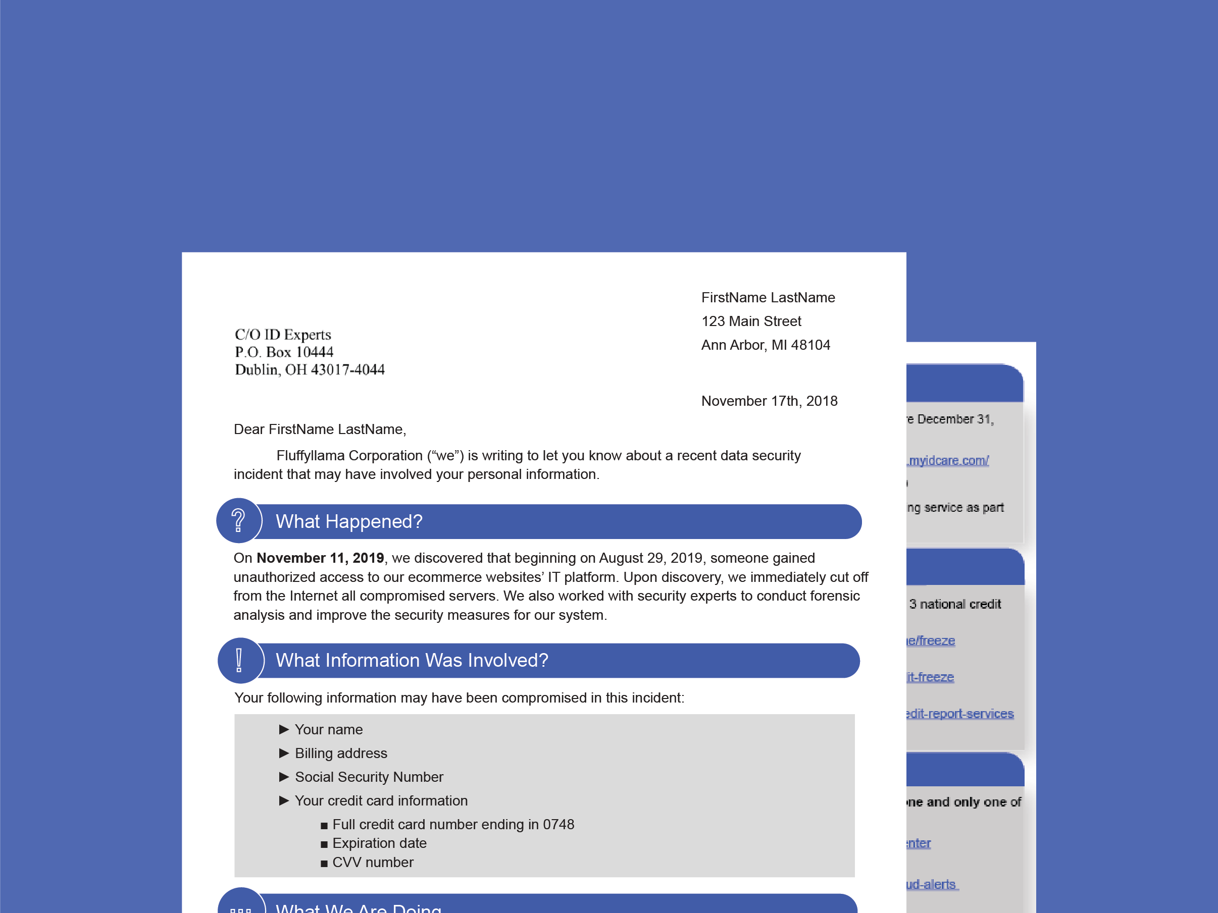
We developed our design based on representative examples of existing breach notification letters. The design instantiation shown in Figure 1 is based on a breach notification letter sent by Rail Europe North America Inc. on April 30th, 2018. Our design makes improvements in the following four areas:
We conducted a preliminary between-subjects lab study comparing our improved design (treatment) to the original letter by Rail Europe North America Inc. (control).
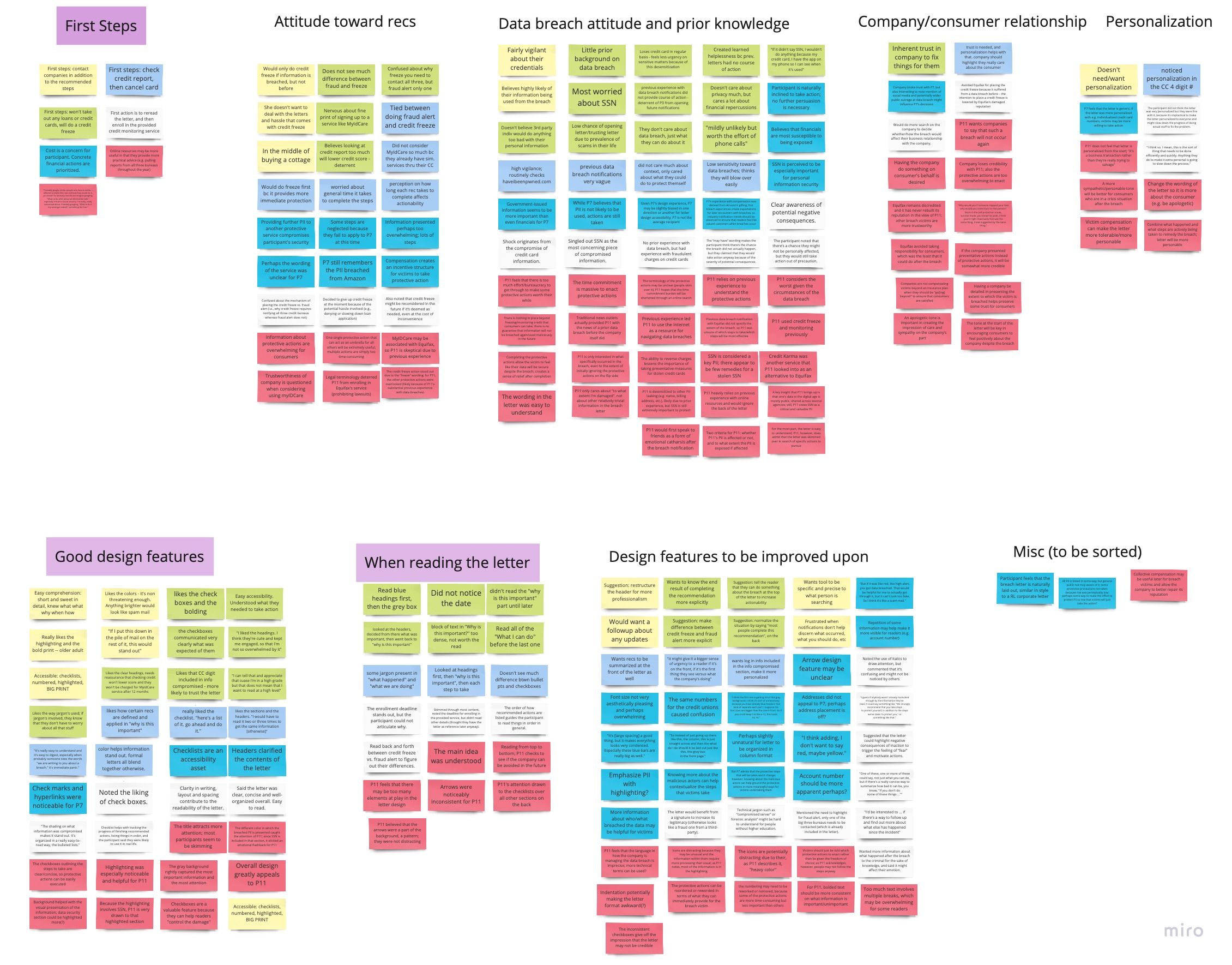
After interviewing all 12 participants, we annotated the transcriptions and consolidated all of the key information into an affinity diagram. We sorted them by noticeable themes, and organized our findings through this method. Below are our control and treatment affinity diagrams, respectively.
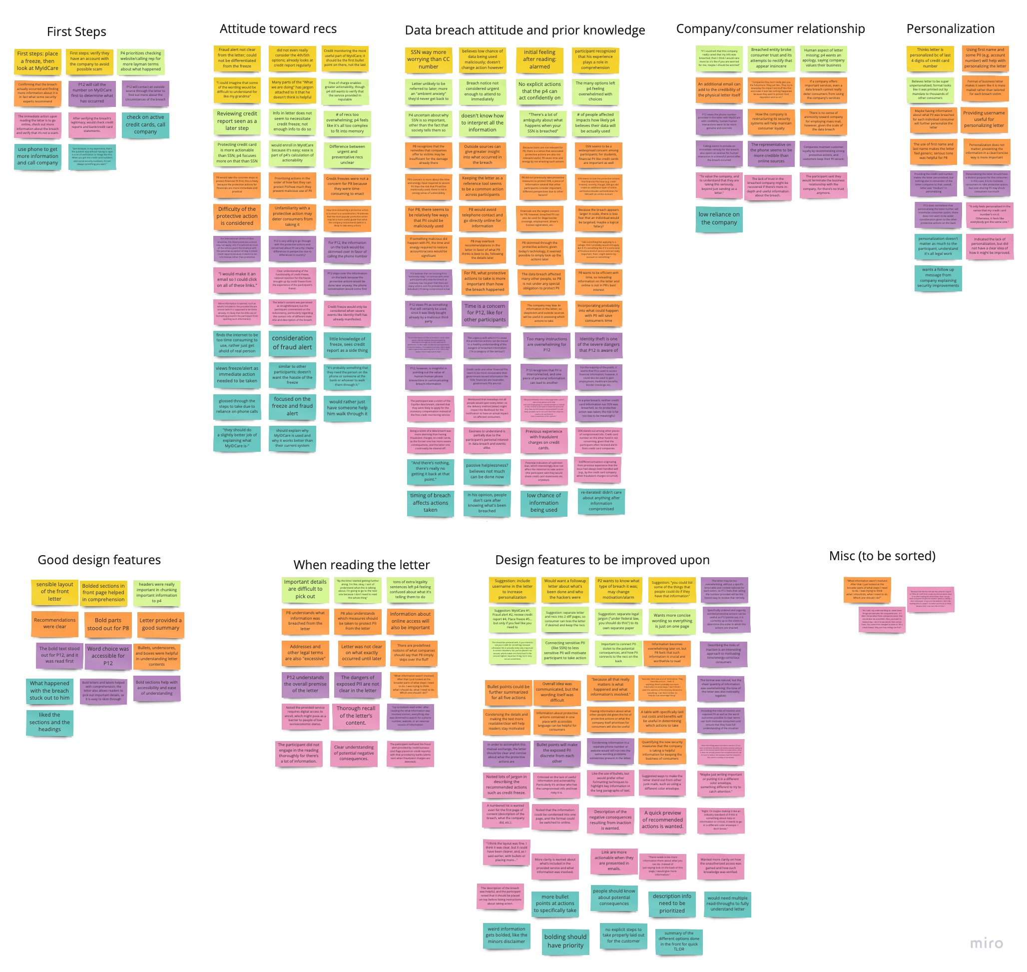
Attitudes toward the Breach
Participants in both treatment and control conditions were confused about the difference between fraud alert and credit freeze. Nine participants acknowledged that the exposure of their SSN was the most alarming motivating factor to enact the recommended protective actions. Interestingly, all noted that if the SSN remained secure, they would simply cancel the card breached, void any inaccurate transaction, or take other less precautionary
measures. More participants in the control condition felt overwhelmed by the sheer amount of information they needed to read compared to the treatment condition. Four noted that they mostly skimmed through the letter after reading the type of information compromised in the front and the bolded words on the back.
We also asked to what extent participants felt the notification was personalized to them, and how the breach might impact their relationship with the company. The two groups shared similar thoughts; both believed that the notification was fairly impersonal. Because the company has compromised the user's trust, these participants said they would rather look elsewhere for guidance, like the Internet or over the phone.
Intended Reactions to Breach Notification:
Five participants from both groups, when asked what recommended steps they would take, admitted that they could not distinguish between a credit freeze and a fraud alert. Six participants were skeptical of a credit
freeze, worrying that it would be overly burdensome to enact. The greatest factor that influenced our participants’ behavior was the time required to initiate the protective actions. Six participants mentioned that they have busy lives, and a letter like this would easily be ignored; the actions might require significant time and effort, especially when dealing with bureaucracy, and they would rather delay taking action.
Three participants in the control group mentioned that, after seeing long paragraphs of text, they would immediately save the letter for later. P4 mentioned that they would have “ambient anxiety” – still worrying about the breach, but being unwilling to take action. They also mentioned that they would probably call the company and speak to an individual to get more “layman terms” on what happened.
Opinions Toward Design Features
Participants in the treatment group emphasized design features that aided them with comprehension more frequently than the control group. All participants mentioned color, checkboxes, and headers as key features supporting comprehension. All treatment participants mentioned that the grey on the front page highlighting the compromised information drew their attention, effectively giving more weight to the subject matter.
Participants approved the use of headers and checkboxes. All treatment participants said the headers helped chunk the letter and more clearly partitioned the different sections. All treatment participants, excluding P7, found the checkboxes appealing and understood its intent to promote productivity.
By contrast, little was said about the control notification beyond its front page headers and its use of bolding.